Package Design Tips – Top Ten Tips for Product Packaging Designers
- Dec, 12 2010
- By Clay
- Package Design, Tutorials for Beginners
- 22 comments
The Ten Most Important Things Every Package Designer Should Know About Packaging Design that Have Nothing to Do with Creating a Great Package Design
This is advice is NOT about creating a killer package design, instead, this is about NOT screwing up. If you want to know how to make dielines or learn the theories that drive powerful package designs, I have other tutorials for that. This article is about avoiding the most common mistakes a designer makes when entering the field of product packaging. However, this is not a theoretical list of blunders by some writer cranking out another generic puff piece from stuff they copy and pasted off the web. This is the real deal. I’ve made all of these mistakes myself back in the day, so don’t feel bad if these seem like news to you. Nobody gets everything right the very first time…or even the second…and perhaps the third as well.
1. Use Adobe illustrator
I know you don’t want to hear it but you need to break your addition to Photoshop and learn the beauty of Illustrator. In the printing world and especially packaging, vector rules the roost. So forget Photoshop. Pretend it doesn’t exist. You shouldn’t be using it, so the sooner you make the switch the better.
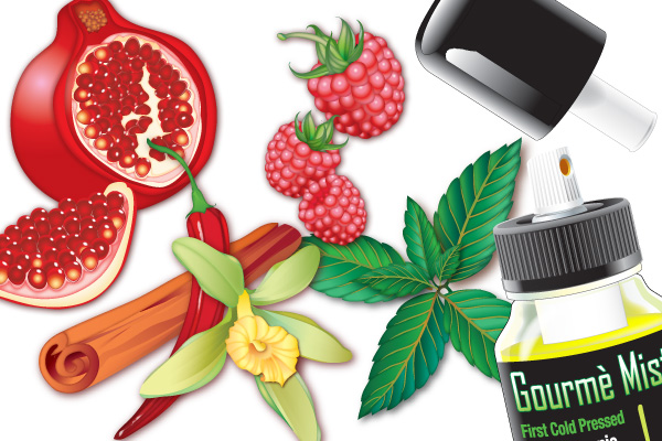
This was all done in Illustrator. These can and have been blown up to the size of a tradeshow booth without any loss of clarity or color. That's the power of vector art.
You should only use Photoshop for three things:
- Image editing (masking, color correction, touch-up, collages, etc)
- Coloring raster images ( painting, drawing, etc)
- Web design
Once you get good with Illustrator you’ll find your self using it as much as possible as the advantages are so great it’s worth mastering the learning curve.
2. Mind Your Dieline
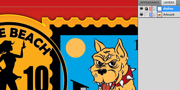
Put your dieline and your artwork on two separate layers. Stack the dieline layer on top of the artwork layer. I’d lock the dieline layer as well so you don’t accidentally move it or mess it up.
3. Watch Your Bleeds
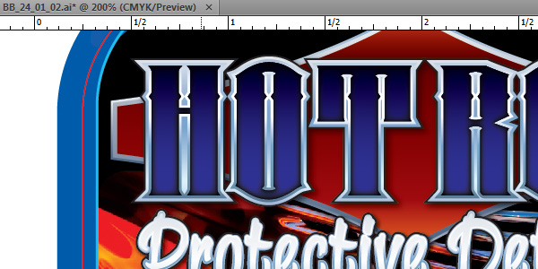
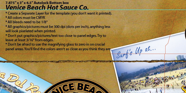
Always include a 1/8 inch (.125 inch) bleed minimum, and when in doubt, give them a full quarter or even a half. Better yet, call up the printer and ask what their bleed requirements are.
4. Converting Text to Outlines
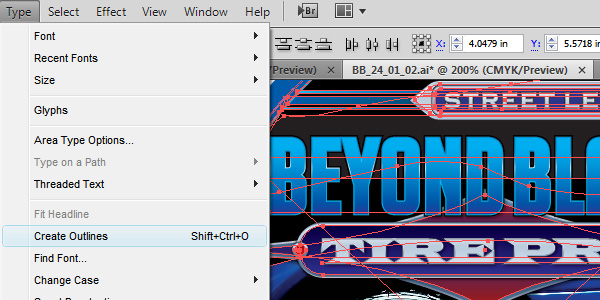
Before sending file to printers convert all text to outlines and expand all objects. FIRST, save a copy of your master and add the word “outlined” at then end. Then open this new file, choose Select >All and then choose Text >Convert to Outlines. If you don’t follow this rule religiously you will someday convert the editable master to outlines and then close the file, thus ruining it for ever. I’m serious. This is the most important rule as this mistake is permanent. The other mistakes are fixable. If you want to be extra diligent then go to Select >All and then choose Object > Expand Appearance. This will convert all your applied editable effects like zig zag and warp into a permanent state. Now there’s no way that cool arched text banner will print wrong.
5. Embed Those Files
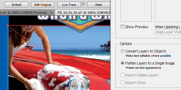
Before sending to printer embed all placed files. Select image then choose Embed and follow the prompts.
6. CMYK Always
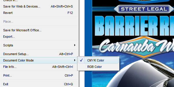
Make sure your color space is CMYK. This stands for Cyan, Magenta, Yellow and Key (Black). This includes ALL placed images, so convert all your photos and raster images to CMYK as well. Just make it a habit. The placed and embedded files will regularly trip you up as your client will always send you RGB images and it’s very easy to touch them up, save them, and then forget to convert them to CMYK.
7. Use Rich Blacks
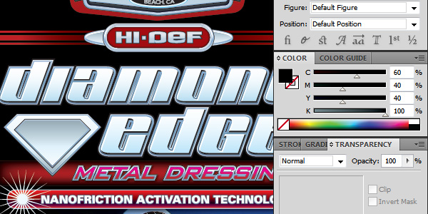
Use rich black for all your big black areas. Rich black is adding some Cyan, Magenta and Yellow to 100% Black. A popular rich black is 60/40/40/100. Don’t up your CMY total higher than this as you want to stay within the suggested 240% maximum ink saturation. Small type should just be black (0/0/0/100) unless you’re printing digital then you can go all rich black without any registration issues.
8. Those Damn Barcodes
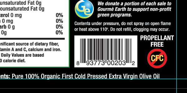
If you don’t have the real barcode, grab a fake one off the web and use it as a placeholder. Keep the barcode at a minimum of an inch and a quarter wide (1.25 inch). You can safely chop the height down by half but the width must be at least this 1.25 inches wide if you want to be 100% safe. Don’t think you can design a great label and just make the barcode fit later. Design for it from the beginning. If you need to generate a barcode from your client’s UPC code then use this Free Barcode Generator.
9. Print and Assemble
Always print out your dieline and make a prototype. Don’t ever trust your dielines or your measurements. Print it out and assemble it to make sure it’s correct.
10. Proof This!
Do not sign off on any proofs. That is your client’s job. Your job is to make sure it prints as intended. Your client must take responsibility for typos.
Call 831-566-3046 or email me if you’d like to discuss what great branding can do for your product packaging design.
File Under: Design and File Prep Tips for Graphic Designers Making a Package Design – Top Package Design Mistakes – Avoid These Common Package Design Design Mistakes




Dora E. H. Crow
Thank you for the tips — just in time, too. I’ll be taking an Illustrator class next week, and I’ll share this link with the class. :)
By the way, I just saw your cool Canna Cola labels! –> http://www.santacruzsentinel.com/portlet/article/html/render_gallery.jsp?articleId=17179763&siteId=6&startImage=1
Clay (The BDD Dude)
Thanks. I’m very pleased with how they came out.
Petra
Thanks for the tips. You are right, i always forget about converting format to CMYK, and then they call me from printing house :)
Mell
I have often been told to never use Rich black in artwork as not all printer companies are alike. If the registration is even slightly off, it screws up the design BIG time, and you get that nasty blurring effect. So my experience is to use only 100% K (Black) with no additional colours. It is, after all, black. This is true for print only, any designs for web can definitely use Rich black.
Clay (The BDD Dude)
I’ve always used rich black and I’ve never had registration issues. Even white text on rich black is usually fine. Plus 100% black actually doesn’t print black, it’s more of a really dark charcoal. If you put them side by side the difference is startling.
Also you can’t use rich black on the web, rich black is for CMYK printing, but monitors are RGB. Working in CMYK colorspace on a monitor is a simulation of what will it look like when printed. CMYK is subtractive color, RGB is additive (though instinctively it feels like it should be the opposite because it actually describes how we perceive color in print versus on a monitor)
Mick
Very good. This lets me know there is someone out there that gets it. I worked in the trade show industry and most of my day was spent converting and fixing client files. To anyone reading this, #10 is probably the most important point. IT IS A RULE THAT YOU MUST NOT SKIP.
Suzana
Hello!
Do you have any resources on where I can find templates (or die lines as I just learned!) for nice packaging?
Do I have to hire an origami artist? I know there are a few books by Rockport, but where do you usually find your templates if there is no Gum box for reference?
Clay (The BDD Dude)
There are several sources to download free dielines such as http://yourpackagingsource.com/pages/packaging_products.html. However, this is not the proper way to do things. First you need to decide on what printer you are going to be working with. You also need to know exactly what physical containers you are going to us. For labels you can easily make your own if you have physical samples of the containers (jars, bottle, tubs, etc). For boxes, you’ll be working directly with the box printing company. They are the ones who will create your dieline and then give it to you. They should also have a set of containers to work with.
Samantha
This article is incredibly informative.. I must say – I learnt a few new things :)
An idea for another article might be what questions to ask your clients when they have asked you to do their packaging design.. There is not a lot of information on the web regarding that.. so I have kinda been flying by the seat of my pants on that one :)
Clay (The BDD Dude)
Funny you should mention that. I’ve been working on such an article. I’ll be posting it soon.
Nancy
Thank you for the tips. I am saving the tips for when I start using illustrator. I have been feeling like I have to make the shift from photoshop to illustrator for a while now.
tyler
where do you designers get your packaging designs printed? I have a design ready, just have no clue who to hire or what website to use to get it printed on the box. It is a cover similar to the box they use for the Nest thermostat on their website. Just a bigger version to cover a 12x12x10 cardboard box. Thanks in advance!
Clay (The BDD Dude)
http://boxcoop.com/ is a good place to start for short run box printing.
But the part about your question that makes me nervous is that you have a dieline ready but haven’t picked out a printer. You should always choose the printer first as they will work with you design the dieline. I hope you’ve printed out a prototype and assembled it to make sure it works.
renju b pillai
I am really happy to read this…This is what I really need
Thank you…!!
michelle
my product is a dry spice mix. any suggestions for finding the right package designer/contact person to help me with packaging such a product? I’m really clueless with this part.
Akshay
URGENT
Hi Clay, I am an Artist and Designer and have got a package design work and needed your help.
There is a bandage product design i did and the client liked it and wants me to design the packaging as well. I have learnt and done package design in college but this is my first real package design work.
The packaging is a tin case and i have received the tin template from the client. I mostly do character and game design so always work in photoshop. The client is a small and new company and is paying more than 80-100$ thing. The client is not a big pro company and he don’t care if work is done in ps or illustrator or the packaging builds a brand or not but his main view is to get a attractive and killer package and i can do realistic rendering and design that’s why he wants me to do it.
But the client is paying me well so i m concerned about providing him with pro looking and a packaging that will create a brand for him and sell the product.
1) I use photoshop and haven’t used illustrator for any work and don’t know to use it much. But client won’t need the work file only this packaging will be enough. So i don’t think working in photoshop for this job would be a problem.
2) The packaging is Tin so should i work in CMYK only and not RGB?
3) The product design is done but the product hasn’t been manufactured yet so i don’t have a product shot but just the bandage graphic.
It would be of great help if you could guide me little bit on these points.
Thanks a lot, i have already learnt few things by reading your posts.
Akshay.
Clay Butler
Yes, CMYK. Make sure to include a 1/8 bleed to the dieline. I’d just stick with Photoshop for now just so you can get it done on time, but everything from now on should be Illustrator (unless it’s image manipulation or a natural painting design…but even then you will always import those into your Illustrator document. So the final file is always Illustrator even if there are lots of placed raster images.)
Akshay
Thank you Sir for the reply will keep that in mind.
Clay Butler
Note: The poster and I handled this offline.
Eleojo
Hi Clay,
just to say thank you for the great resources you have put up here. visiting your site for me is like stepping into a classroom. Keep up the good work.
Cheers!
Kamal
Thanks Alot Mr. Clay for putting time and effort in writing such a rich post of information that really every designer needs to know to avoid screwing up. Thump up and keep the posts coming ^_* .
ZEEPack
I’m a designer and I second you on your tips. A great resource to learn.